


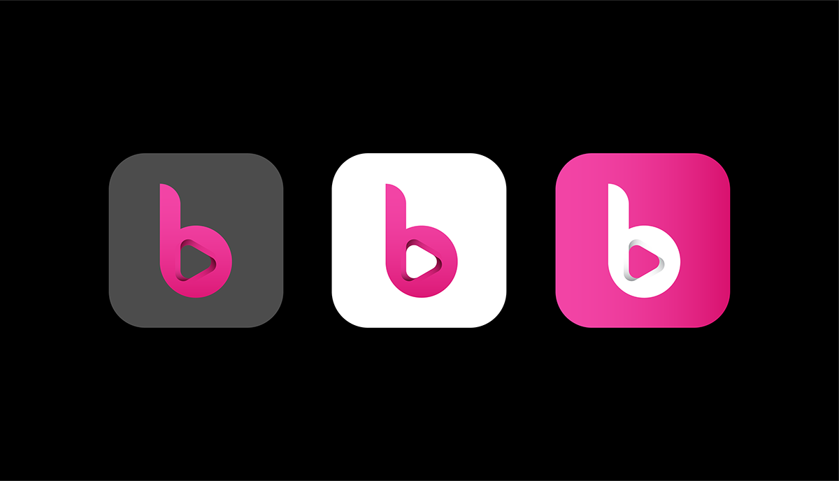

Logo Icon: The logo features a stylized letter 'B' as the central icon, creatively designed
to evoke the rhythm and flow of music. The letter 'B' is crafted with smooth curves and
subtle accents, giving it a playful and dynamic appearance. The open space within the
letter 'B' forms a visual representation of a speaker or sound waves, symbolizing the
brand's connection to the world of music.
Color Palette:
Vibrant Pink: The primary color, representing energy, passion, and a contemporary
edge. This bold pink hue adds a touch of excitement and sets the brand
apart in the music industry.
Vibrant Pink: The primary color, representing energy, passion, and a contemporary
edge. This bold pink hue adds a touch of excitement and sets the brand
apart in the music industry.
Tagline (Optional):
"Feel the Beat" - A tagline that invites the audience to connect
emotionally with the brand's music and experience.
"Feel the Beat" - A tagline that invites the audience to connect
emotionally with the brand's music and experience.
Overall Design Concept:
The Bruuh logo is a fusion of elegance and playfulness,
capturing the essence of music through its dynamic 'B' icon.
The use of vibrant pink creates a memorable and eye-catching
visual identity. The custom script font adds a personalized and
human touch, making the brand feel relatable and engaging.


